When products are easy to use, they make customers happy and they keep spending money. Yesterday morning I was reminded that my new Apple TV should arrive today. I got a new Apple iMessage and an email with a link to the following:
The XXXXXXX actually included a unique ID and then just ask for my email address making it fairly easy to login and check the status of my order. They even used a short URL to this something like apple.com/s/aUniqHash. I totally used something like this on a past startup, uBlanket. When a customers needed to design their blanket after we got their shirts and took photos of them, we would send them a unique URL that just asked for their email address.
Similar Dominos provides an awesome almost real-time tracker of when you order to when your pizza arrives. I am not that big of a fan of their pizza, but they make it easy to answer the question, where's my pizza.
Okay, back to Apple for a second, they provide all that you would need in one view: Print Receipt, Return Item and Track Shipment. They even show that a signature isn't required (although UPS still required one!)
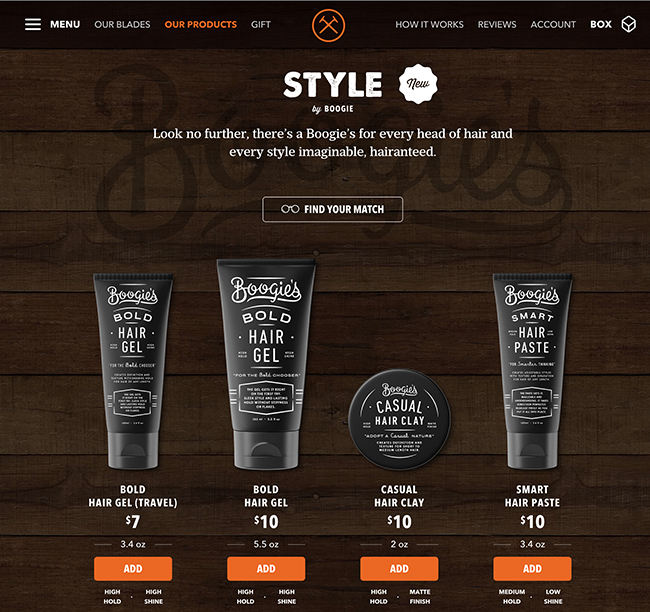
One company that I rave about is Dollar Shave Club (Affiliate Link). They offer 3 versions of quality razors that are affordable and come each month like clock work. I have tried them all, but pretty happy with the low-end one as it's cheap and does the job. Right before a package goes out they send a simple email reminder if you want to add other products. Think about this for a second...
Remind the customer a package is going out and offer to add other items
With just one click I can see a type of product like hairgel or shaving cream. With a second click I can add it and just made a purchase. Two clicks and boom, instant revenue. Now this works well with subscription products as the payment is already stored.
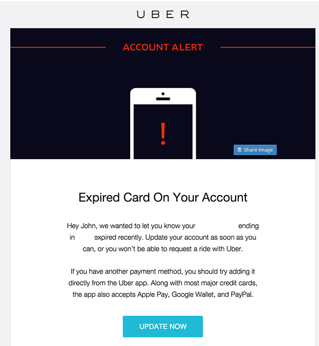
Speaking of payment, every subscription company has the same problem, getting the customer to update their credit card. This can be a simple reminder and even a great way to offer something small or test an idea/message.
Along with most major credit cards, the app also accepts Apple Pay, Google Wallet, and PayPal
Now that one line isn't that special, but it's a quick mention that UBER accepts other payments as well, although no Bitcoins just yet.
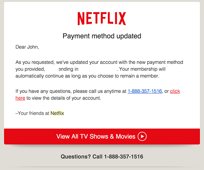
Netflix posts their phone number if you have questions and even a link to view the account details. Now one would imagine that this link would autologin to your account, right? or at the very least prefill the email address of the login box.
NOPE - Now I understand emails like this and setting up autologins for accounts is a pain for developers, but by spending a little bit of development time, you make it easier for customers!
When it comes to apps, one thing that I can not stand and would HIGHLY suggest anyone with an app to leverage this idea on your landing page.
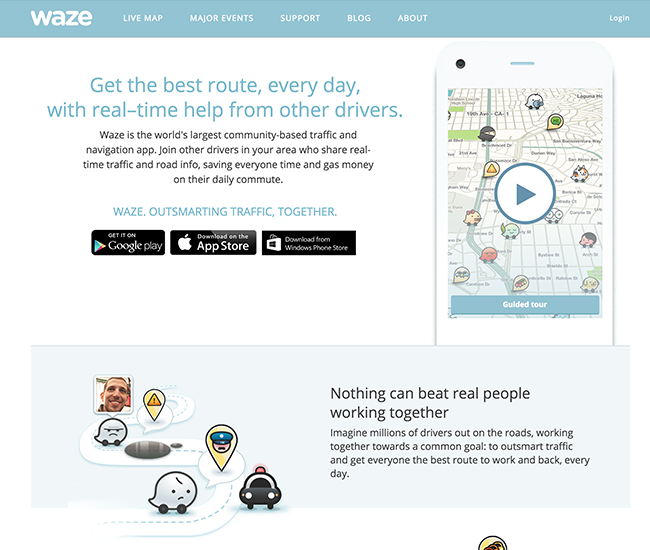
So Waze just updated their app and were featured on Product Hunt. Notice anything wrong with this landing page?
Quick Hint - You are viewing the website from a desktop/laptop computer and NOT a phone...Give Up? How easy is it to install this app while on the page. Yes, you can click the iTunes link, open iTunes and install the app, but then you need to sync your phone or you pull out your phone, search for the app and then install it, but is that the easiest way?
Now I have to give it to Google as this is the one feature missing from Apple that I can't stand they haven't stole borrowed from another company. The ability to directly install an app on your phone via your desktop/browser. Granted you can install an app over the air (limit to 100MB) but I am talking about the ability to see the app, click install and have it start the download on the phone (like andriod) without syncing.
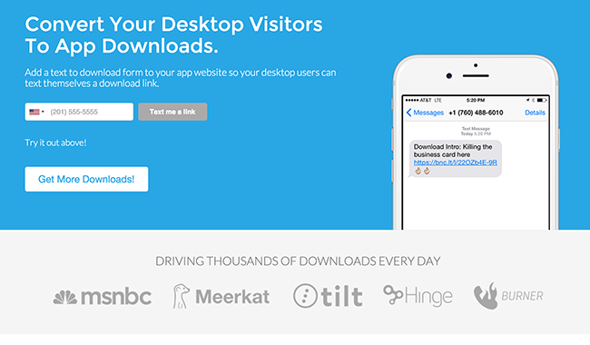
Now since Apple doesn't have this feature, but what's the next best thing, a text message. Luckily LinkTexting created the killer integration and makes it simple for developers to add to their landing page. Check it out!
What are some of your favorite hacks for making customers happy, let me know :)


